Description
Wilder is the ultimate and professional way for you to present your portfolio or the very best starting point for your own corporate website. If you are searching something different and out of the line, please check out the Wilder – Flat One Page Responsive WordPress Theme!
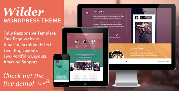
Wilder is fully responsive – resize your browser window to see it in action. All the layouts are built with responsive design in mind. It works well on desktops, tablets, and mobile devices. The template is perfectly adapted to various screen sizes, and its attractive fresh design makes it look great.
Wilder is a fully configurable and easy to use WordPress theme with a lot of great features. It has been specifically designed to be easily customized and it’s created by using the latest HTML5 and CSS3 techniques. With a responsive design it is easily usable with any device!
Features
- Fully Responsive WordPress Theme,
- One Page Website,
- Valid HTML5/CSS3,
- Advanced CSS3 Animations,
- Two Homepage Layouts,
- About Us Page,
- Team page,
- Services Page,
- Two Portfolio Layouts,
- Two Blog Layouts,
- Contact,
- Masonry Blog,
- Well organized and commented code,
Updates
v2.0 – March 14th, 2015
- NEW FEATURE – WordPress 4.1 Compatibility
- NEW FEATURE – New Theme Option Features (Custom CSS and Preloader color fields)
- FIXED – Updated Plugins
- FIXED – Theme Options Loading Speed
- FIXED – Responsive Issues
- FIXED – Browser Issues
Credits
All images used in the demo are not distributed with the theme.
JavaScript
Modernizer – the feature detection library for HTML5/CSS3
Shadowbox
jQuery.ScrollTo – Easy element scrolling using jQuery
jQuery v1.7.1 jquery.com
Foundation Responsive Library
jQuery Masonry v2.1.08
jquery.nicescroll
